Niche Homepage
In February 2021, the Creative Design Team at Niche kicked off our rebranding of our homepage, and we used this as an opportunity to explore new branding. As it stands, our current homepage is a mix of both our old and our new branding.

Niche is a product that helps students, families and more find where they belong - from places to live to
K-12 schools. Alongside that, we offer partnership opportunities for colleges and schools. Our homepage had to capture a wide variety audiences and clearly explain our product to those audience.
We wanted our homepage design to be unique and design orientated, yet friendly and usable for our user. We took influences from our old branding and the direction we were wanting to head. We wanted our branding to be more mature, so we added more muted colors as the primary colors and have bright pops of orange, green and more. Another big change we implemented was the tone of our brand - before, our tone was dry and too information heavy. We leaned more on a conversation and approachable tone for our homepage refresh.
Homepage Scroll
Animations
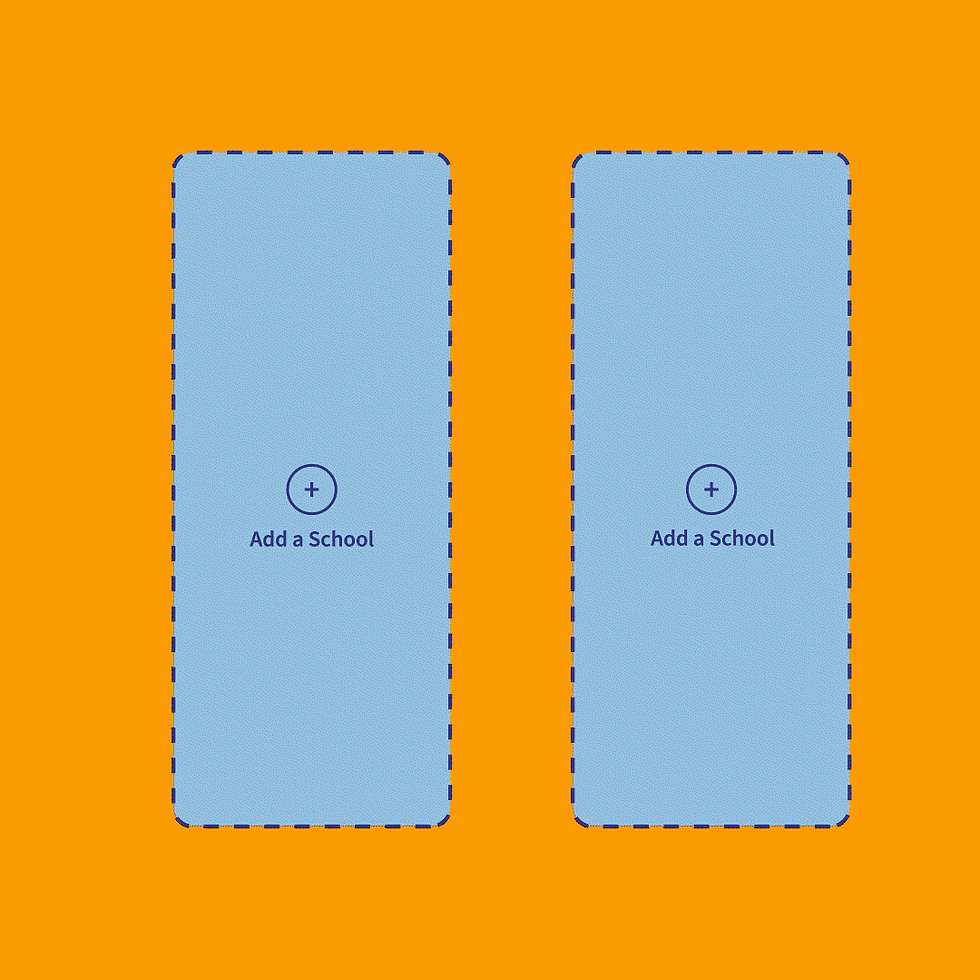

We wanted our homepage animations to be simple but explain the value of our product to potential users. We aimed to "cute-ify" and simplify the UI to make the animations easier to follow.
Documentation / Process
When creating these animations, we wanted to make sure we explored many possibilities creatively and exploring our file type to make sure they were optimized in the best possible way. Above is my research on file types, my style frames, and my storyboards for the homepage animations.
Icons and Illustrations


Research and Exploration


We began our rebranding in tandem with working on the homepage, so while exploring concepts for the homepage, we were effectively researching for our entire brand redesign. At the end of the day, we took influence from multiple of these designs for our final homepage and our overall branding.
Where We Were
