amanda anstett
Niche Brand Evolution
Brand Evolution is the term we used to describe updating our branding without a complete overhaul. We want to leverage the equity that we have in our current branding, but evolve to a fresher look that is relevant to our audience. Our evolution looks at the brand as a whole; internal, client and user. This is the first time Niche has official brand guidelines.
The Niche Audience is ever-changing. We need to appeal to new students, parents, and school administrators in a way that instills confidence to all. To create a brand that is visually appealing to such a wide audience, we must create a visual language that is both sophisticated and playful and must be adaptable based on the audience. Our new creative expression is built with flexibility in mind. Taking notes from our historically green color palette, we have evolved our new look to include more diversity in color. We have added accent elements and updated our illustration style to add interest and increase a brand presence that can be recognized at a glance.

Exploration
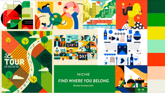
Our Brand Evolution was done completely in-house. As a team of 5, we worked from January 2021 to September 2021, developing our new brand guidelines alongside our daily work. We wanted brand guidelines that were not too rigid, that allowed our branding to grow and evolve alongside the company. We wanted to be relevant, approachable, fun and flexible. To kick off our rebranding, we launched a survey that we served to our employees and to our users to audit where we were currently and where people wanted us to go. We explored many different concepts and mood boards, and after combining, adding, eliminating, we landed on our current branding.
Where We Were

Brand Surveys - Internal and User
Moodboards

Exploration
Our New Look
Niche is a tech company that serves a wide variety of people, from students looking to colleges and first time homebuyers. Our branding had to be flexible and able to accomadate all types of audiences. When developing our new look, we wanted to make sure there was a reason for everything. Drawing inspiration from the original Niche green color, we updated the color palette to have a collegiate base green and greige that keep our designs grounded. Our accent colors are brighter hues that lend themselves to our digital platform. Our stickers are a modernization of stamps, badges, and emblems used throughout traditional academic certificates.


